

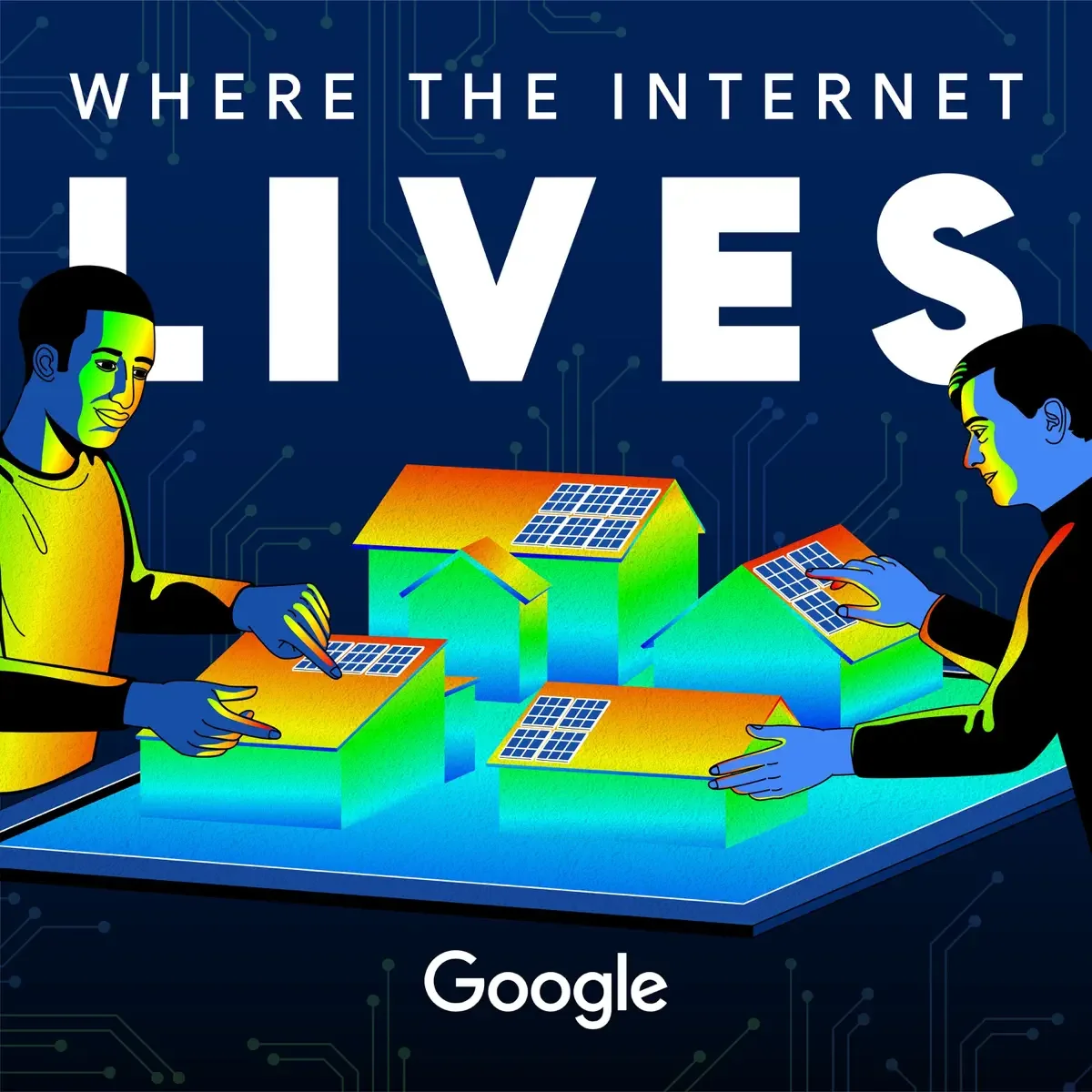
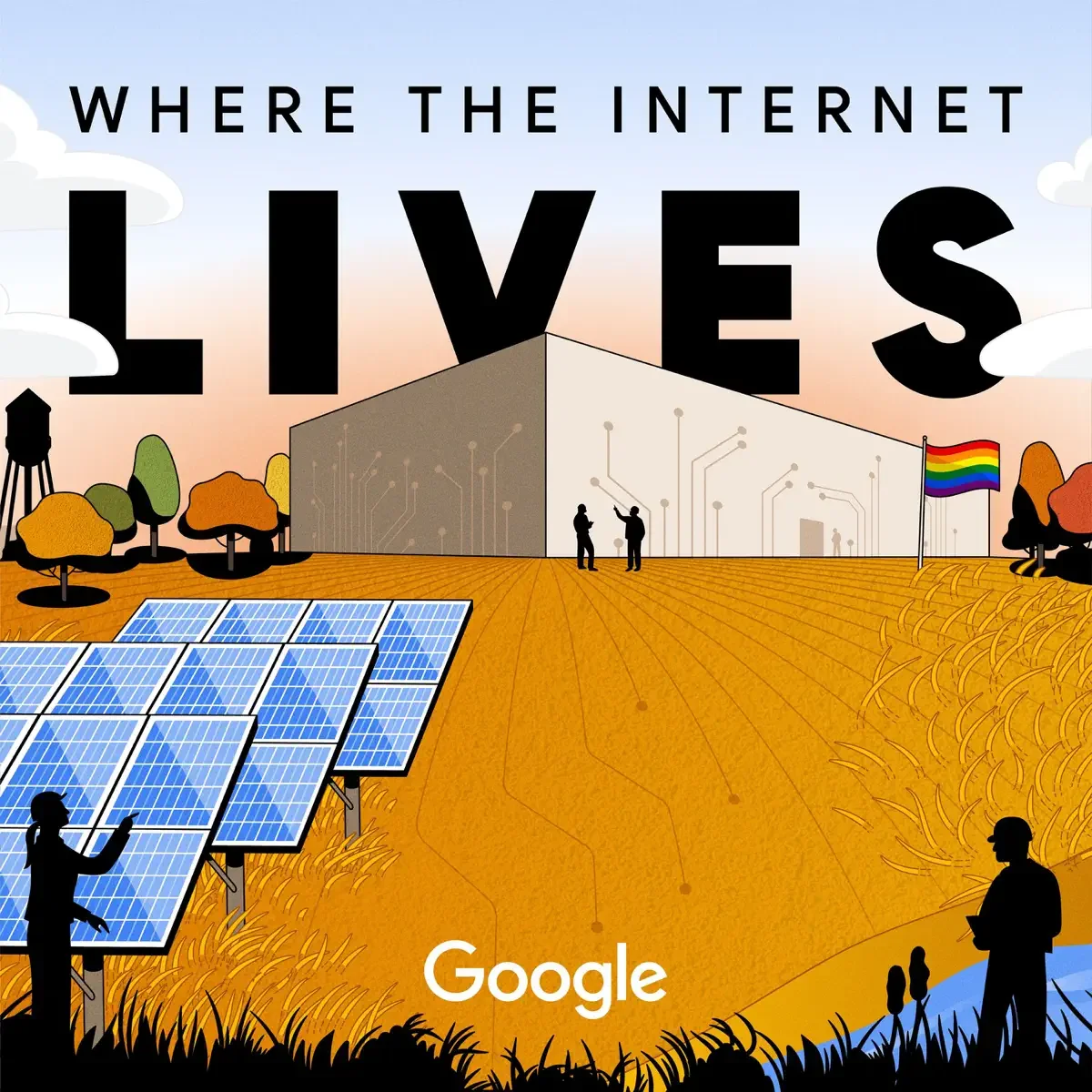
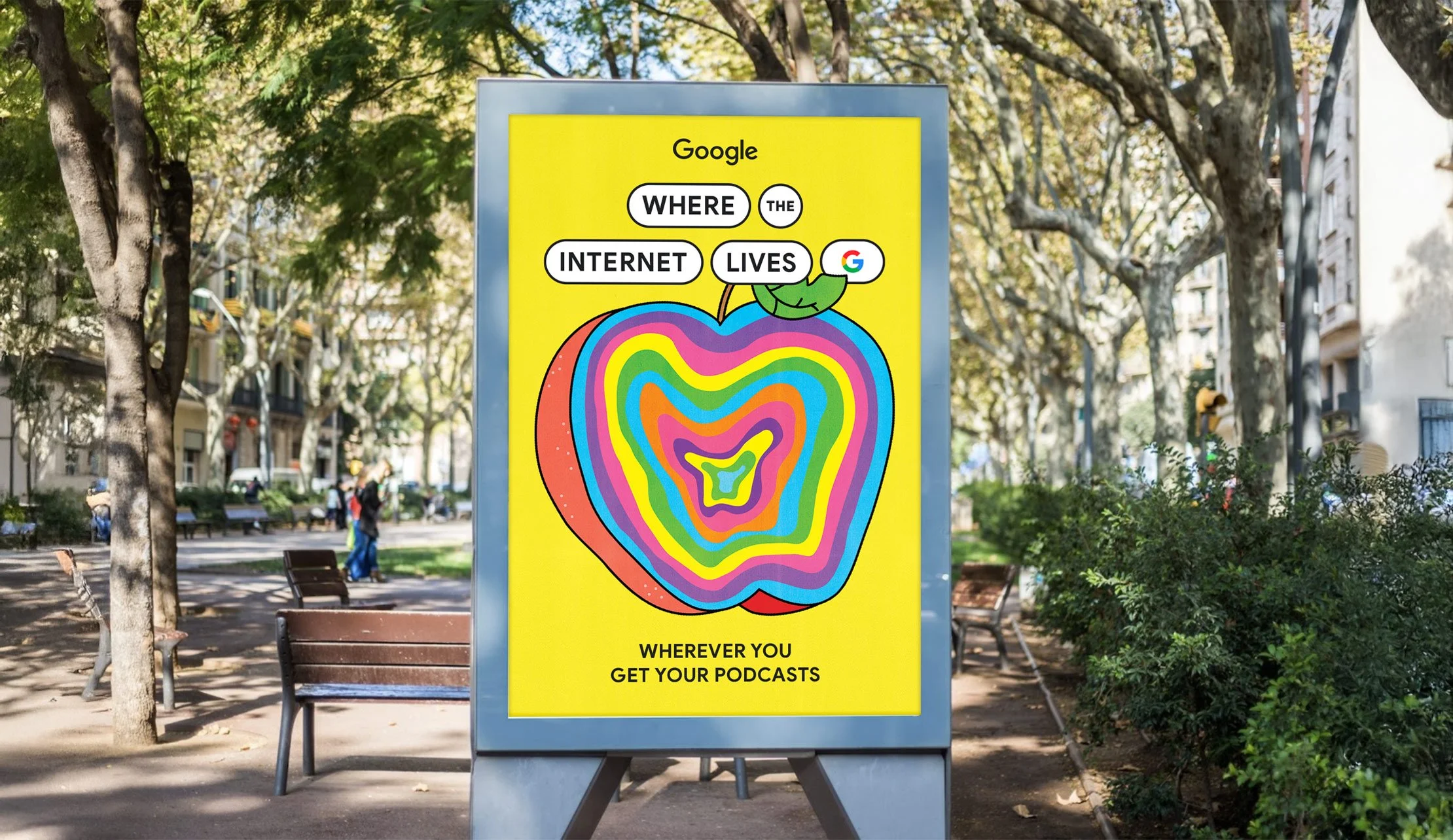
Where the internet lives
Where the Internet Lives is Google’s podcast about the surprisingly interesting world of data centers.
With the launch of season 4 fast approaching, and a new emphasis into a print publication and events, the podcast needed a brand identity refresh that could keep up.
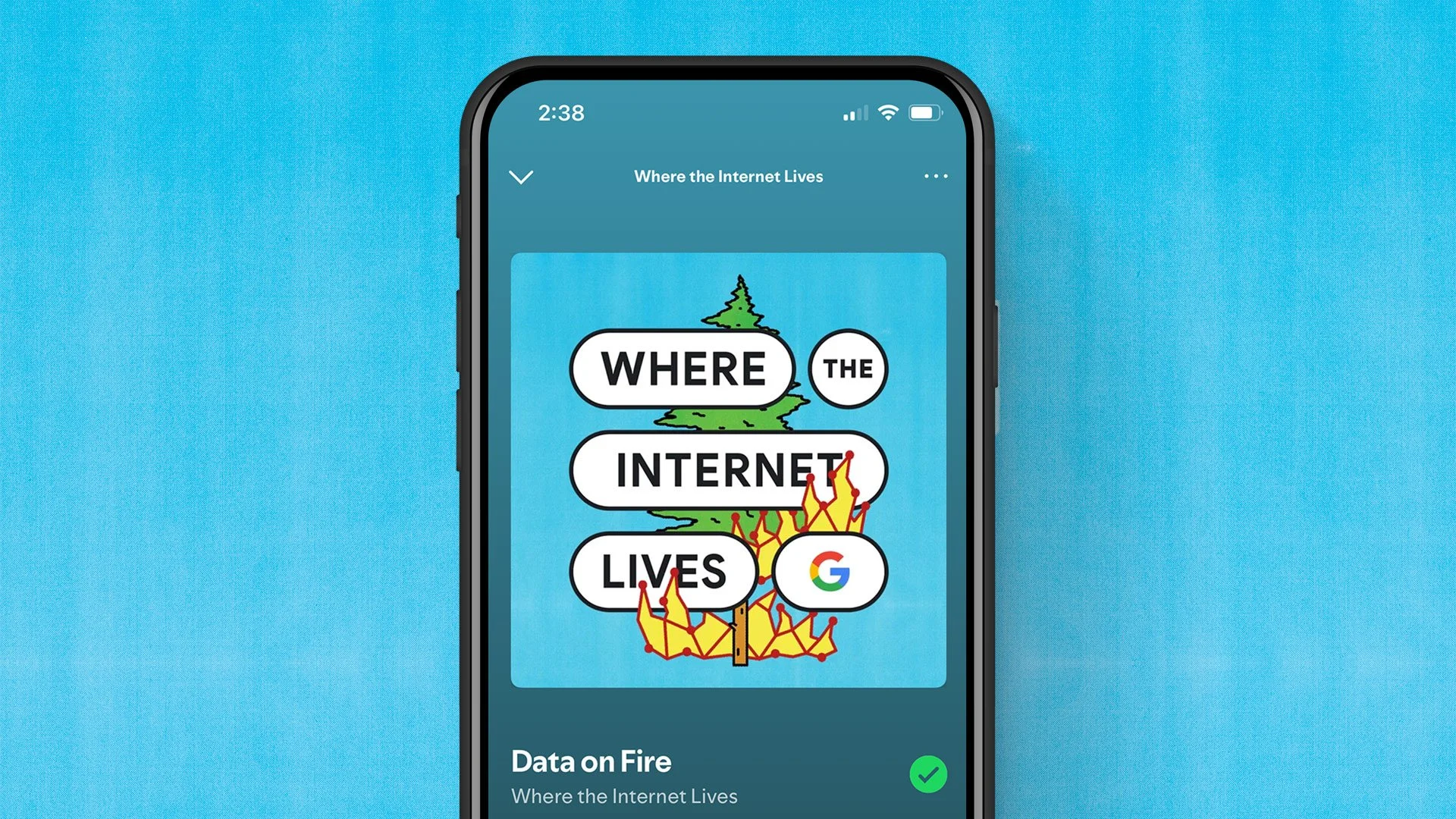
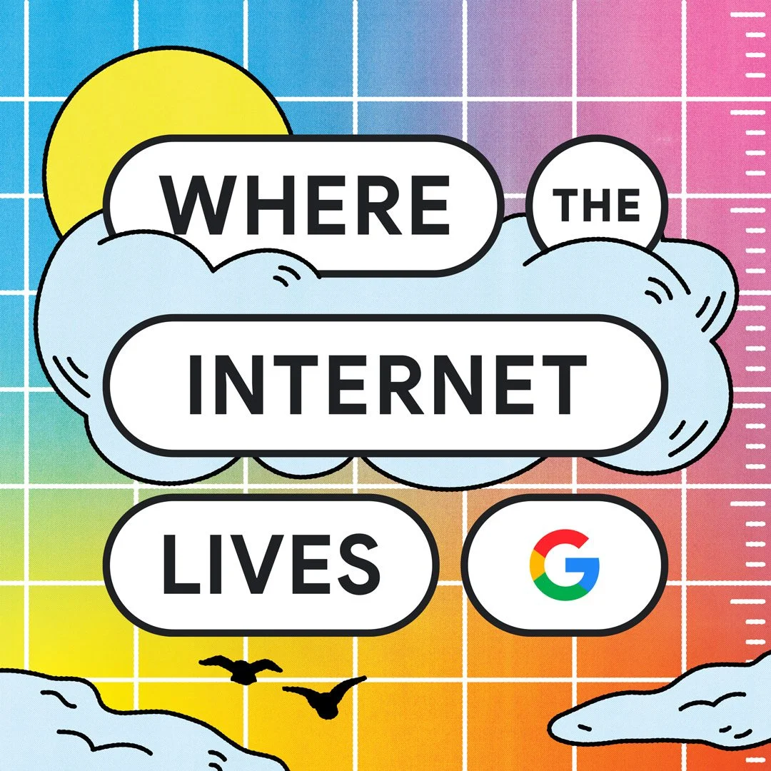
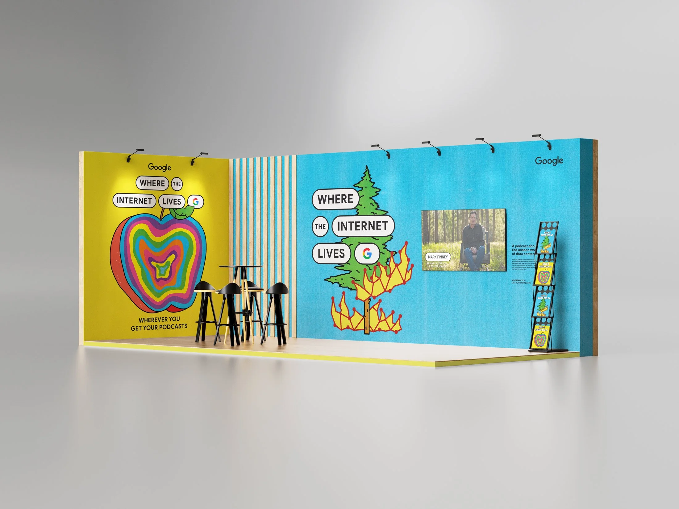
We created a new, flexible brand identity, and complete set of artwork that applied to all of the new season’s deliverables.
Deliverables
Brand Identity, Art Direction, Illustration, Event Design
Collaborators
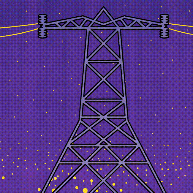
Illustration: George Wylesol
Client
Google
Previous Design
The previous design system overemphasized the word LIVES, and didn’t incorporate the Google identity cohesively.
Though the artwork was successful at times, it also lacked cohesion, with many episodes feeling like one-offs instead of pieces of a larger narrative.
Inspiration
Inspiration came from the ubiquitous Google search bar, and the constantly-shifting nature of internet.
Editorial mastheads, and the flexible range of visual approaches they allow for, also opened up a world of exciting visual possibilities.
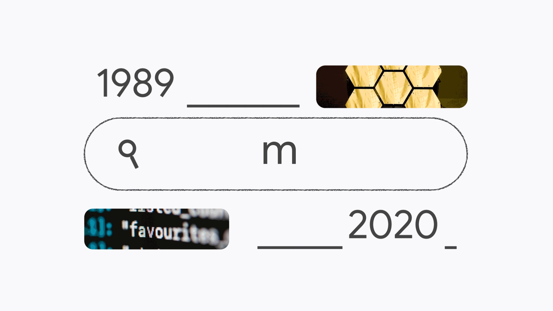


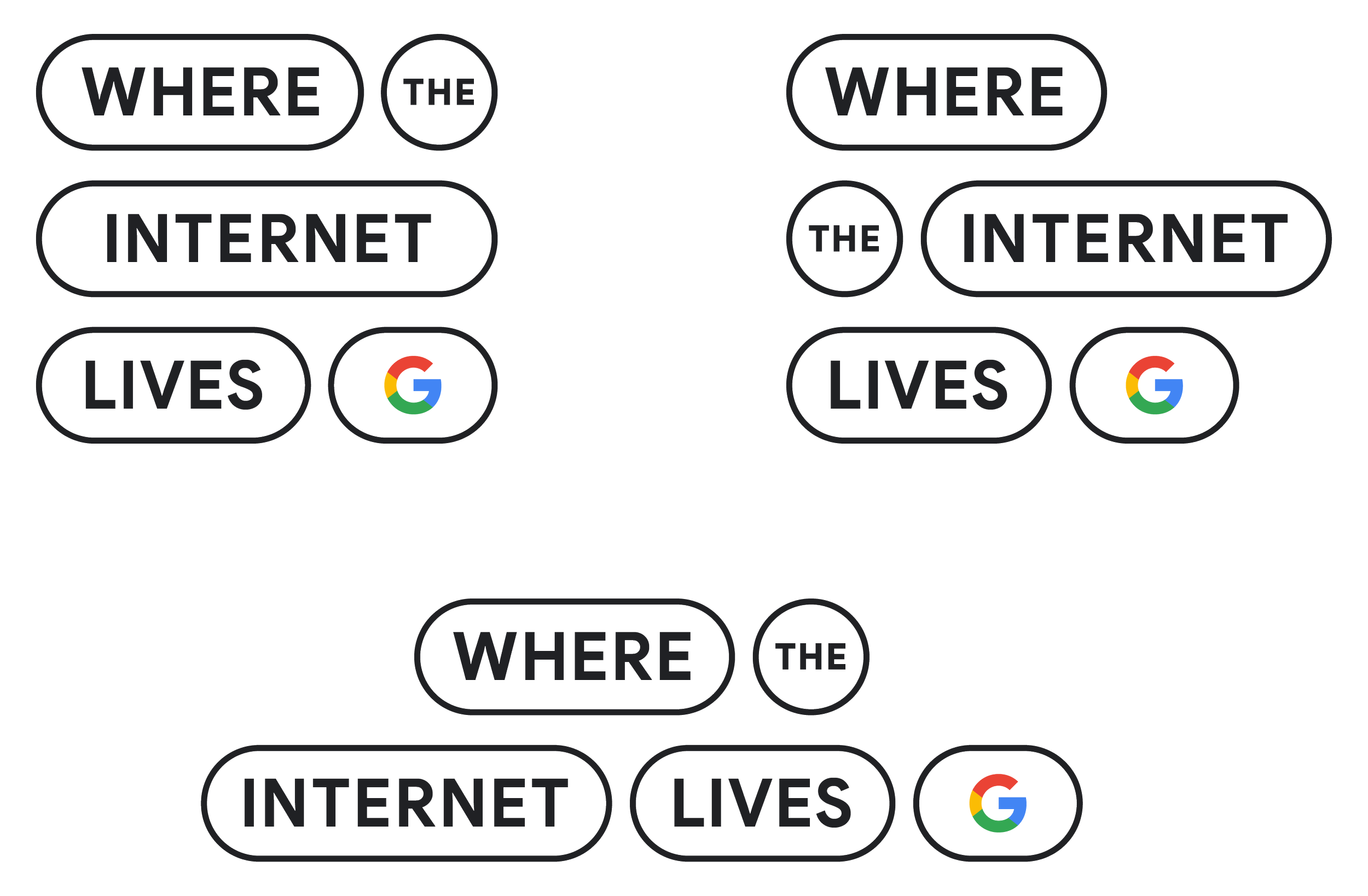
A modular solution
Knowing that the logo needed to work on applications as small as a podcast thumbnail and as large as an event stage backdrop, we created a solution that could flex for any situation.
Season 4 launch
Season 4 successfully launched the refreshed brand identity with five podcast episodes, YouTube documentaries, social teaser videos, and a system that is ready for events and print publication.

Social videos
Each episode had an accompanying video snippet that gave a quick, engaging overview.
Impact
87.5%
Increase in podcast downloads
10x
Increase in film views
2 Awards
Webby & Shorty